June 4, 2020
Forest Lake | Summer Family Portrait Session

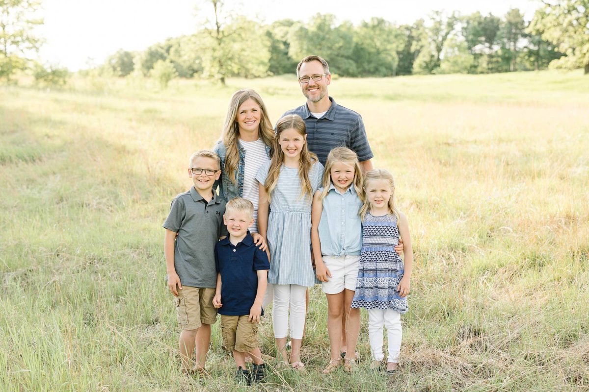
It’s not too often that we can say we’ve known our clients since our college days. Anna met Angela as a freshman in college and we had no idea that her and her family’s friendship would become such an important part of our lives! They have walked by our side through thick and thin over the past decade and we are beyond grateful for their friendship. They will never know the extent to which they have made an impact on our lives and to say it was an honor to photograph their family would be an understatement.
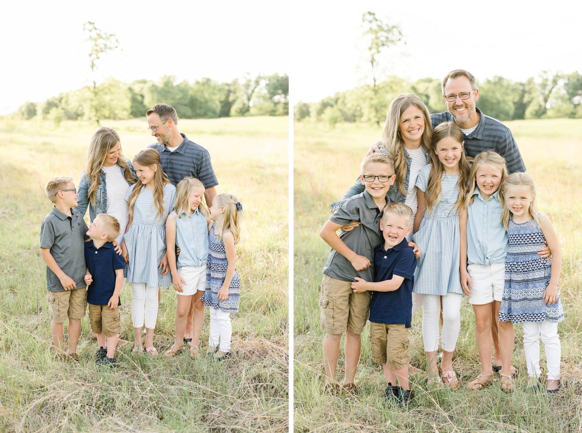
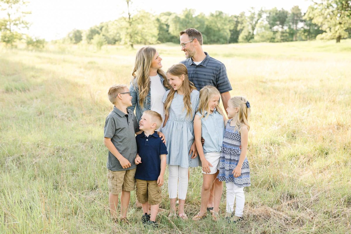
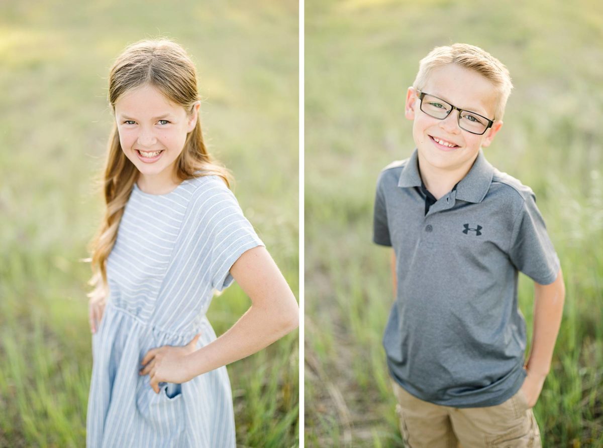
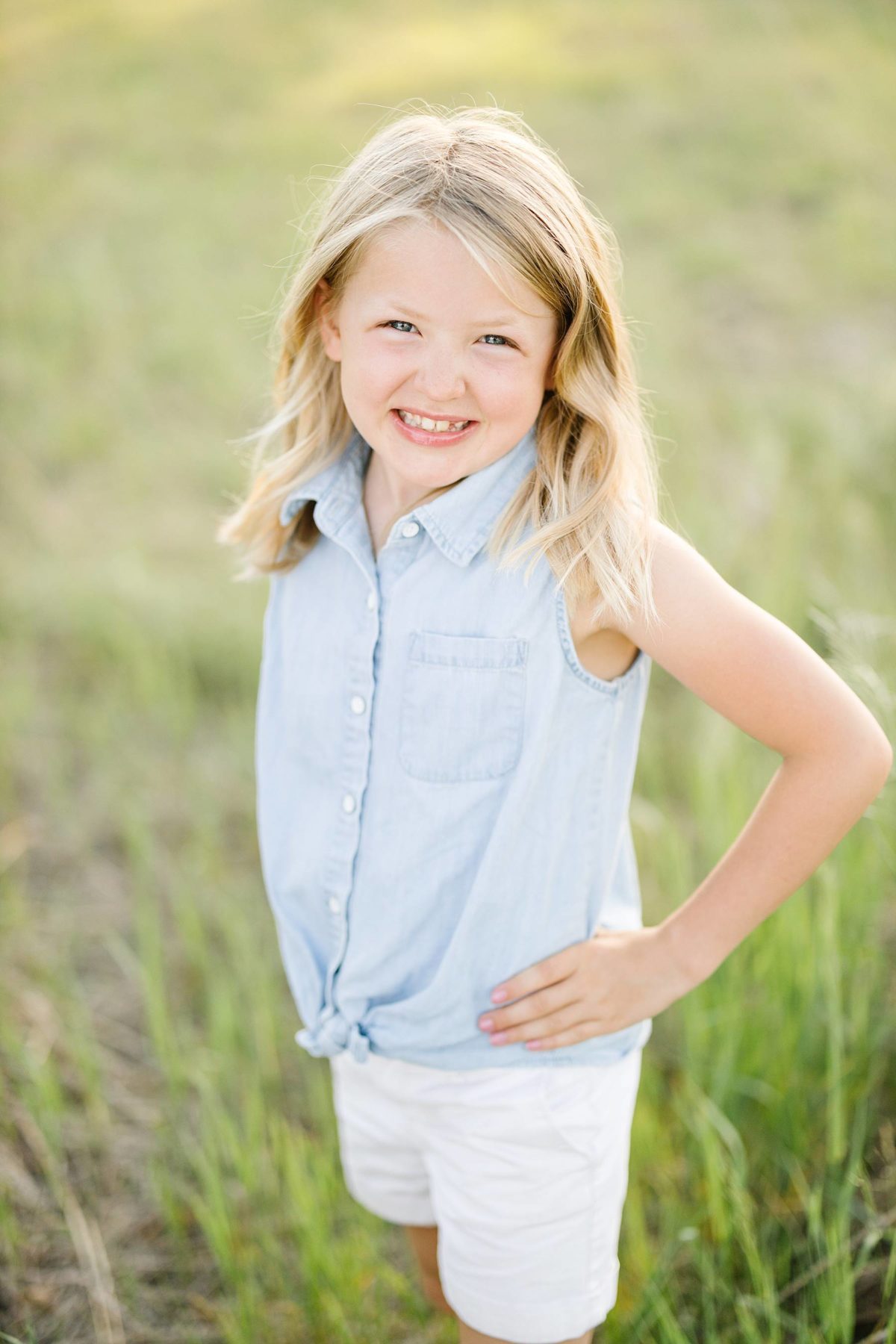
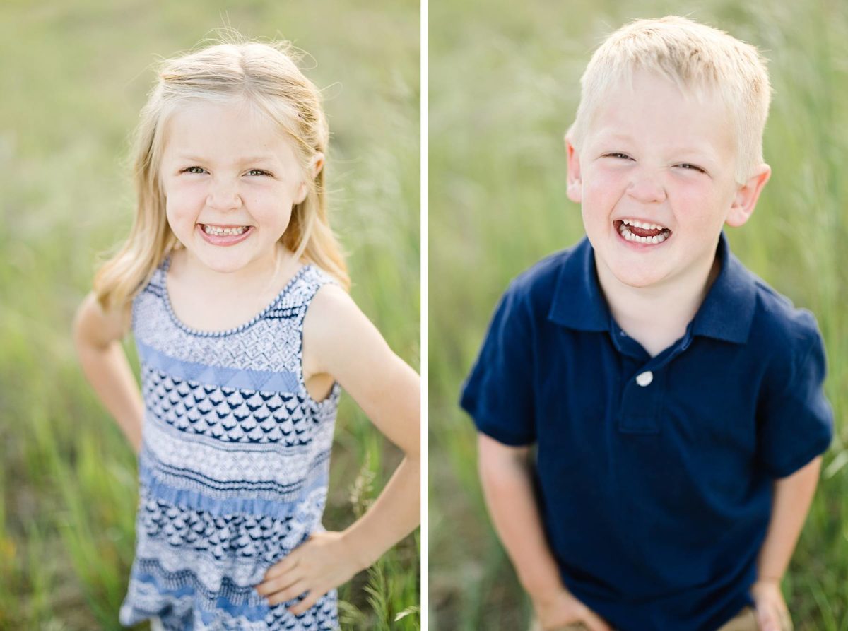
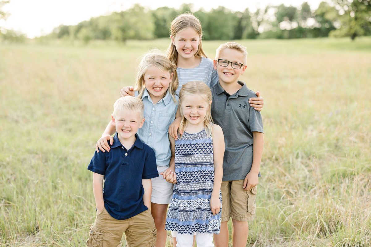
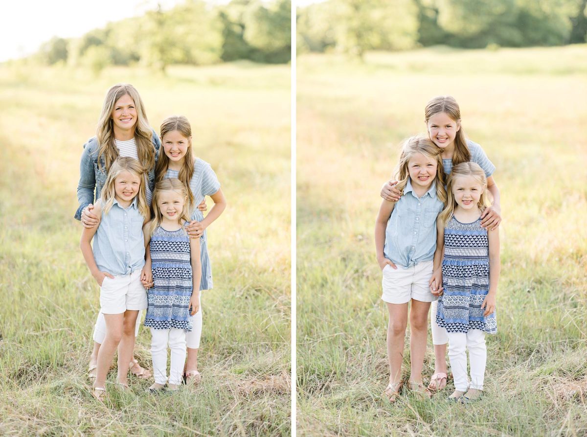
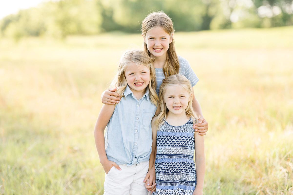
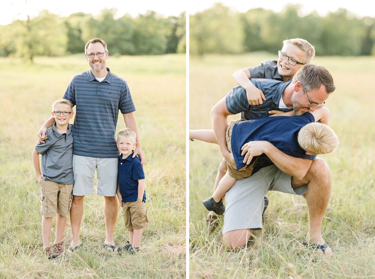
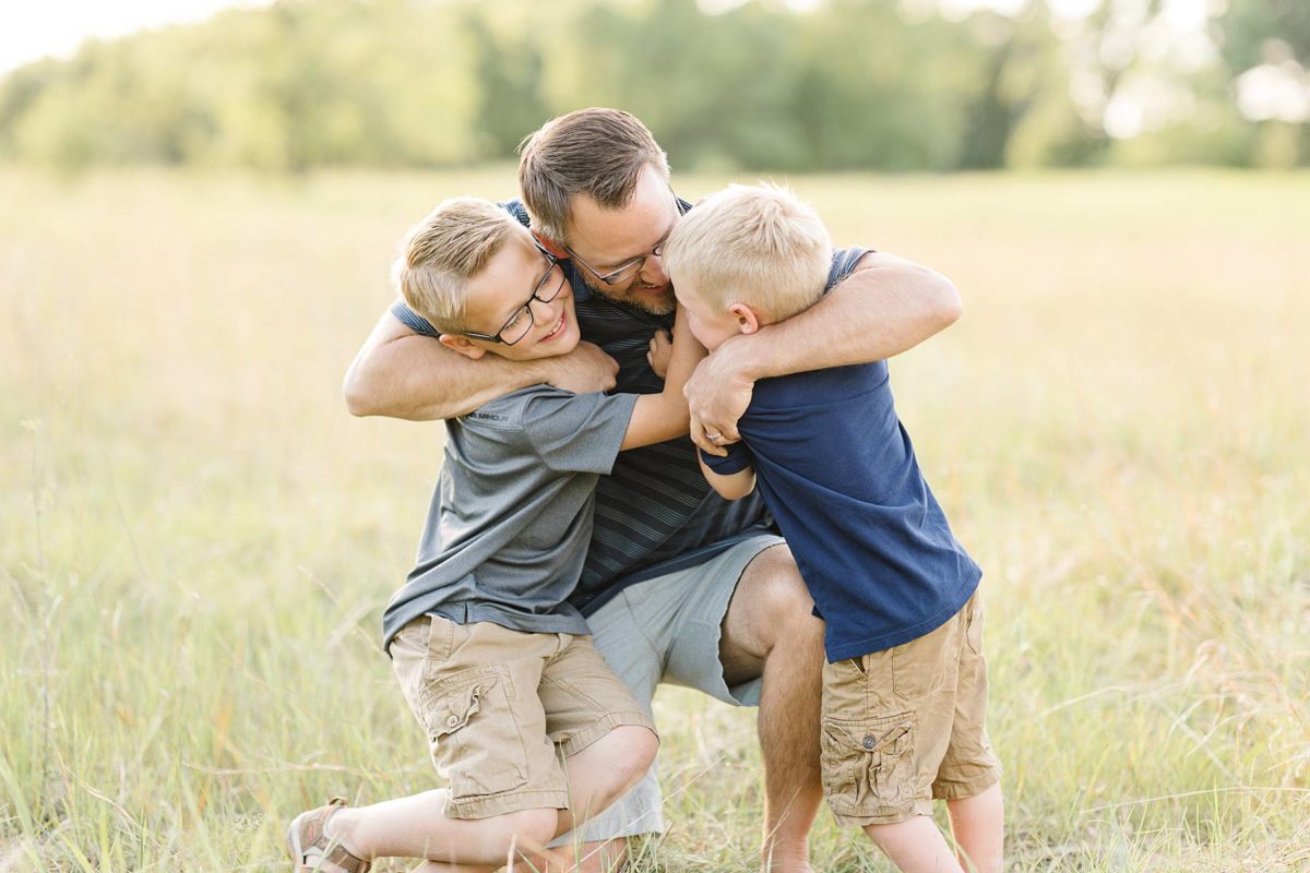
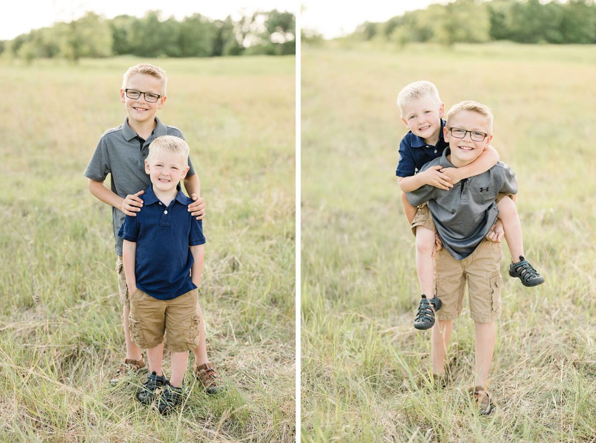
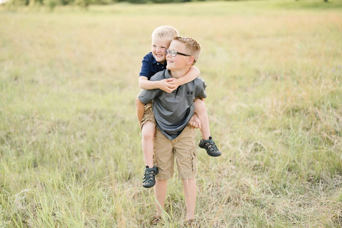
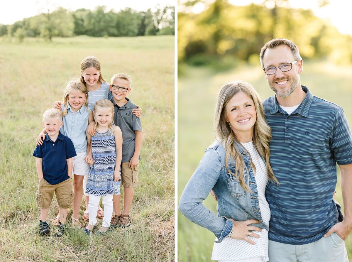
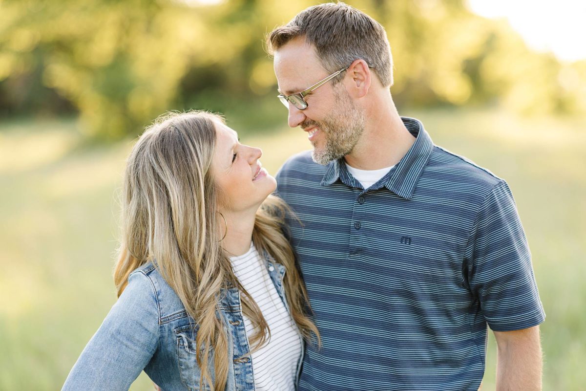
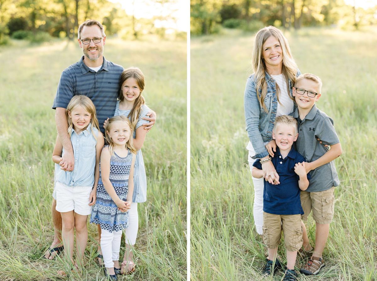
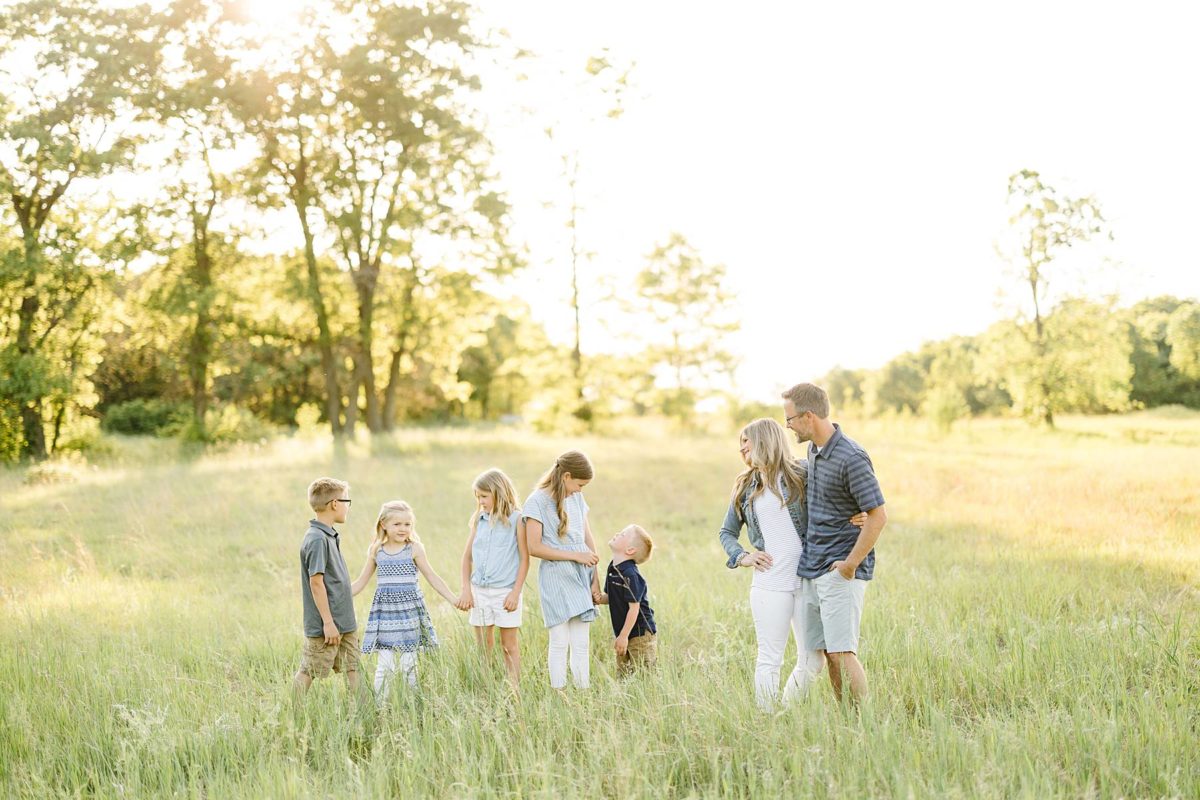
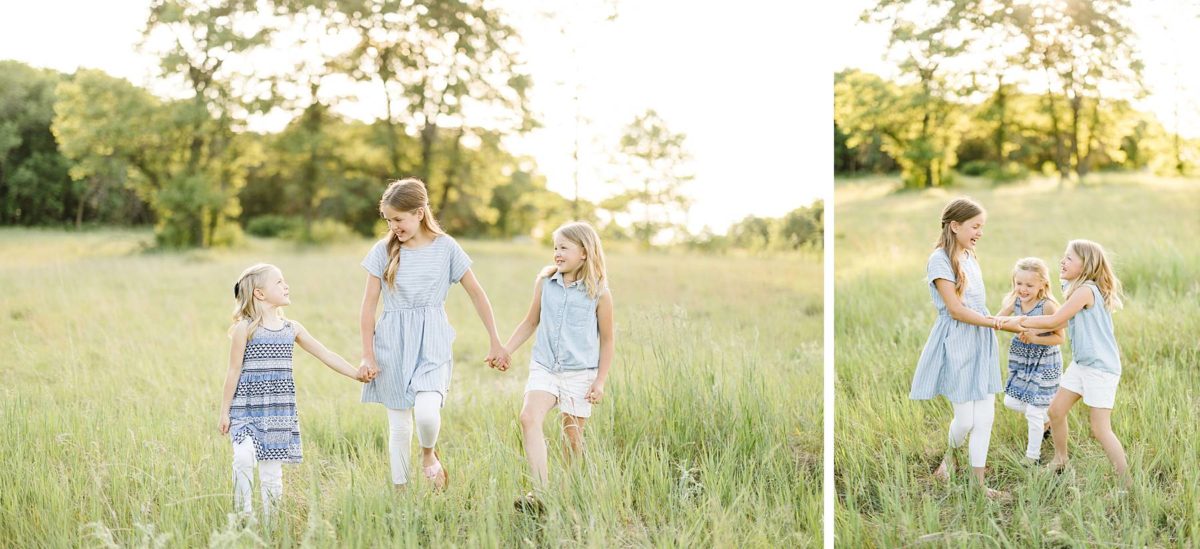
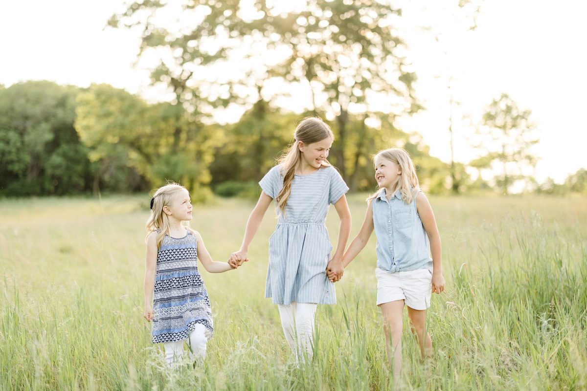
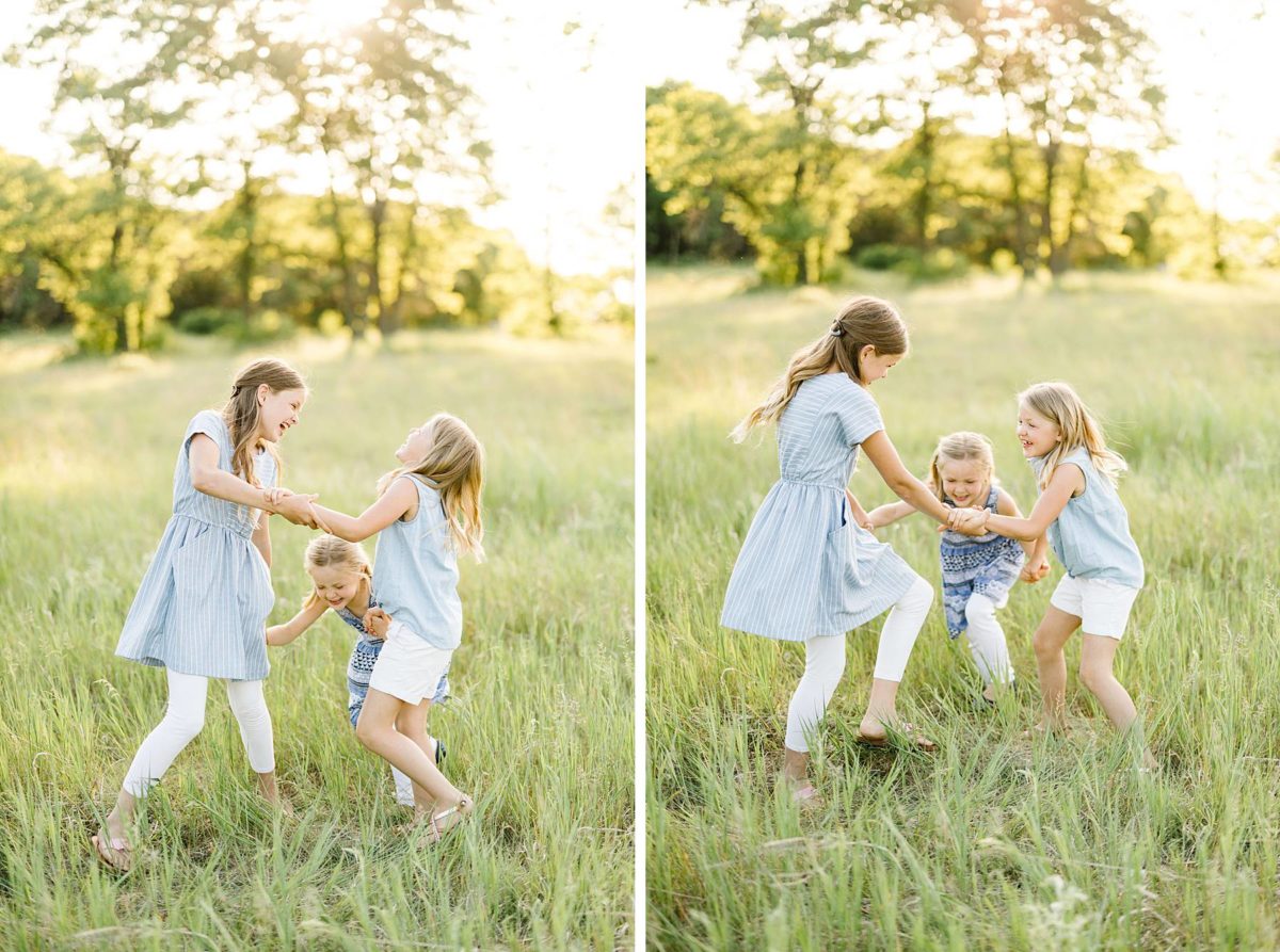
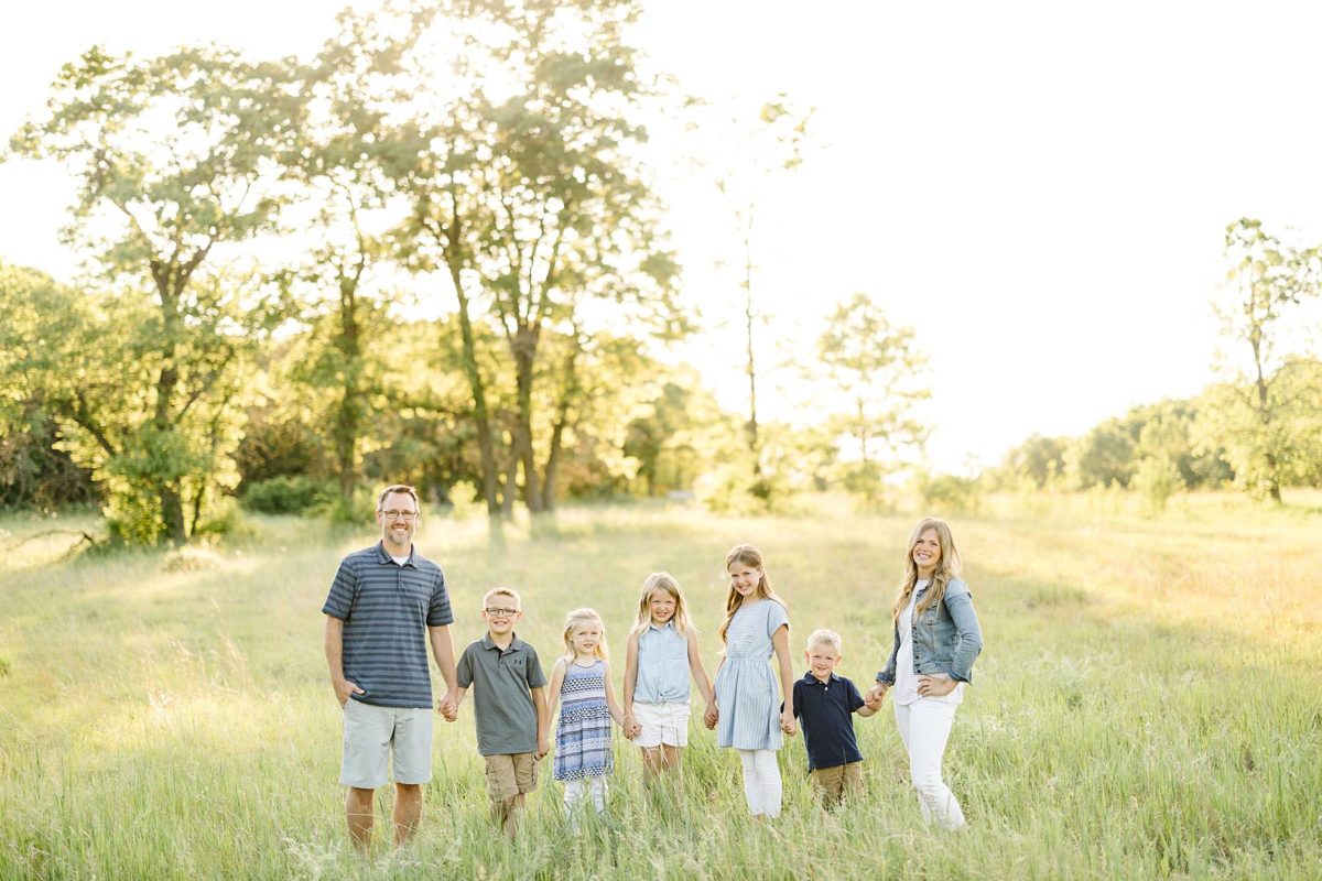
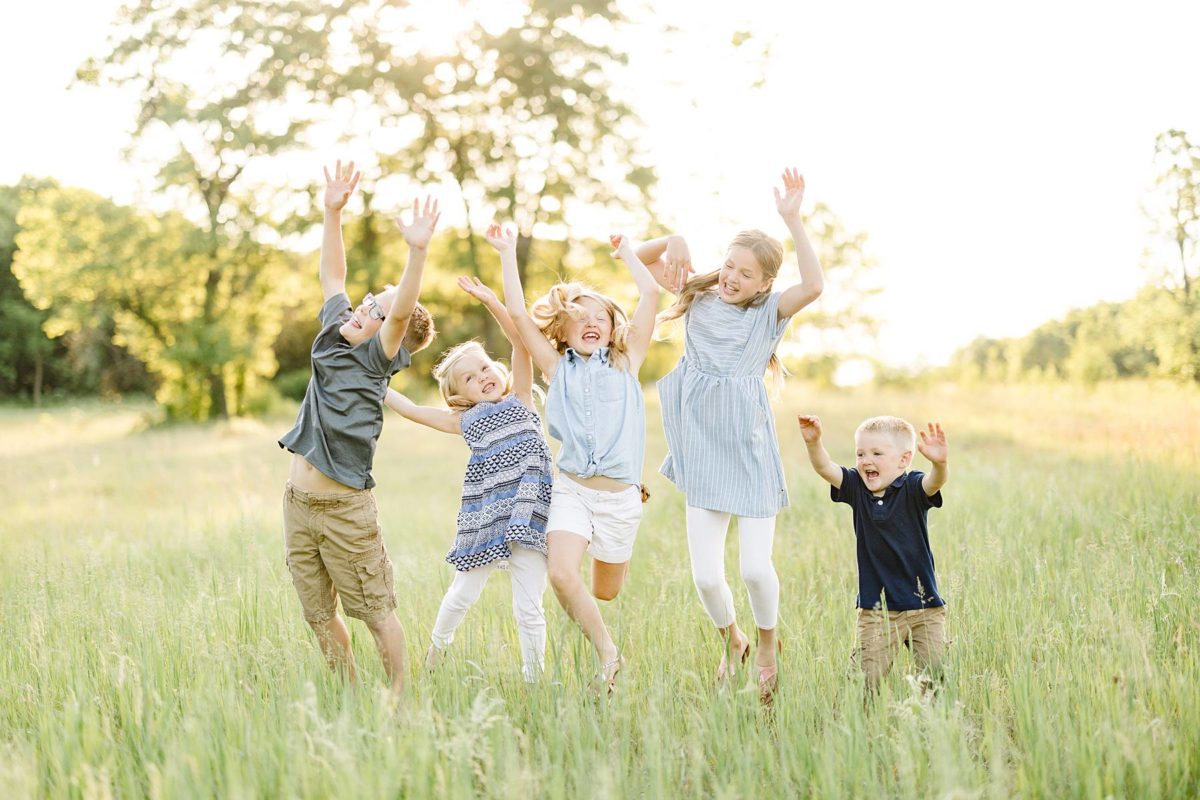
There are so many things we could share about this session but when it comes to coordinating family session outfits, they completely knocked it out of the park! When choosing colors for family sessions, we usually recommend selecting natural tones and more muted shades. By avoiding ultra-bright, bold colors, it will help bring all the attention to our client’s faces and let the eye focus on smiles showcasing their sweet relationships. We LOVE soft shades of pinks and muted blues, and you can never go wrong with sophisticated light neutrals like whites, creams, taupe, or khaki. The softer color palette fits beautifully into almost all natural outdoor environments, and especially complements the greens and blues found around Minnesota’s great outdoors.
As you are coordinating outfits, keep in mind that your outfits will look the most cohesive on camera when the color palettes coordinate, but don’t necessarily “match.” Try to choose a dominant color for each family member, but stay within a similar color palette family. Most families begin with that they already own and then supplement if needed by picking up an item or two if needed. The goal is never to break the bank on clothing but to keep things simple and comfortable to fully enjoy your session!

Share post on Social